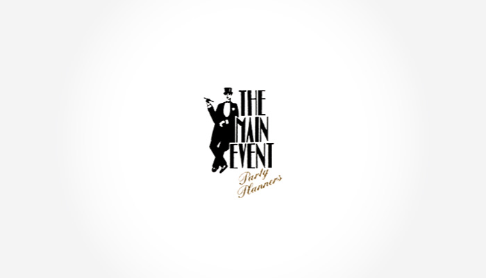
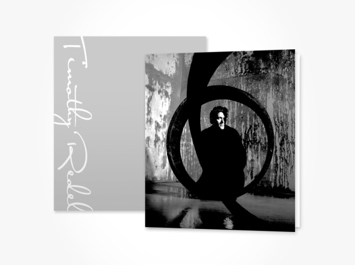
Just a moment...

Branding

Resorts

Chalet Peter Pan

Scope of work: branding, stationery, web

For this luxury ski chalet in Chamonix, the client wanted a branding that was sophisticated, but not slick. We took a classic serif font and replaced the ‘A’ with a pen-and-ink style illustration of a local pine tree, hinting at the resort’s prized location on the edge of a nature reserve.
The trilingual Chalet Peter Pan website had to look classic and sophisticated, but be very easy to navigate. We placed the navigational menu in the top-left corner, uncluttered by any other visuals, and anchored all content—whether text, images or maps—on the same rectangular space on each section. Experience at www.chaletpeterpan.com.

Arama

Scope of work: branding, stationery, web

Arama is a resort company that owns a number of luxury villas in Asia, with a focus on top-notch fitness and tech facilities. To unify the properties, we created an initial-based logo using a unique typeface that conjures a relaxing mood, while evoking a faintly tech feel. We filled the initial with graduating sky-to-sea shades to echo an imaginary horizon.
To differentiate between the resorts, we created wave-inspired secondary prints inspired by each location—a modern wave for the purpose-built resort island of Samui; an ornate wave for culturally rich Phnom Penh; an ethnic wave for Bali; and a retro wave for Macau.

Arama Bali—business card with directions

Arama Bali—stationery

Arama Bali—towels (embroidered with folding directions)

Arama Bali—uniforms + name tags

Arama Bali—signage

Arama Bali—merchandise

Arama website (under construction)

Fabulous Locations

Scope of work: branding, web

Fabulous Locations is a group of luxury private villas, located around the world. All the interiors feature a similar sea- and sand-inspired colour palette, so for the parent branding we underlined a simple wordmark with a striped bar comprising the distinctive shades.
For the resorts, we created ‘swatch’ style iconmarks relating to the respective locations—contemporary tartan for The Rocks in Scotland; a Maori tattoo for Malaghans Ridge in New Zealand; and Thai silk for Ban Suriya in Samui. To experience, click here.

Life

Scope of work: branding, web

For Life—a property development company specialising in exclusive resorts around the world—we combined myriad organic shapes to symbolise the diversity of life, creating a sophisticated iconmark evocative of 20th-century modern art.
For The Headland—Life’s first property in Koh Samui—we created a logo evocative of an actual headland, in one of the few colours at the monochromatic resort. For The Headland Annex meanwhile, we added an additional ‘Life’ shape, hinting at the new development’s physical connection to the main resort. To experience, click here.

Services

Flex

Scope of work: branding, stationery, print

Leading pilates and yoga studio Flex wanted to update its identity to coincide with a move to larger, upgraded premises. Requesting a more “sophisticated, streamlined” look and feel, we adopted a slimmer typeface; fine-tuned the silhouette secondary graphic; and unified the colour palette.
Tulaa—meaning balance in Sanskrit—is a line of leisurewear from Flex. To create a connection between the successful Pilates studio and its fashion line, we adopted the lilac shade from its former iconmark and also one of its silhouettes to replace the ‘l’ in Tulaa.
For FlexKids, Flex’s growing division of children’s classes, we retained the silhouetted figure concept to create a connection with the main brand, and brightened the colours to appeal to the younger target market.

Stationery

Minibus sticker

Original identity

Gift voucher + card

Flyers

Posters

Advertisements

Eflyer

Enews

Temple Chambers

Scope of work: branding, stationery, web

Temple Chambers, one of Hong Kong’s leading groups of barristers, required its new logo to convey the utmost in experience and reliability. We therefore evoked a traditional nameplate using the elegant New Baskerville typeface, and in an industry dominated by blue, opted for a premium palette of grey and black.
To complement the relatively simple logo, and add visual interest to Temple Chambers’ stationery, we added a monochromatic bar along the edges—a graphic interpretation of being ‘called to the bar’. For all information, we used the clear and timeless, Renaissance-inspired Minion Pro.
For the website, we designed a clean, simple layout, incorporating classical, elegant imagery to emphasise the history and gravitas of Temple Chambers, but shot at relatively dynamic angles to evoke modernity. Experience at www.templechambers.com.

TTC

Scope of work: branding, stationery, web

TTC (Transport Technology Consultants) is an established firm specialising in transport policy and ITC (intelligent transport systems). Often working with government authorities, TTC’s new identity had to be fairly conservative, so we created a simple logo fusing the company’s acronym and incorporating a white line to subtly hint at road markings. Asphalt grey reinforces the connection.
To add visual interest to TTC’s applications, we created a secondary graphic based on road ‘arteries’ viewed from the sky.
ITS (intelligent transport systems) websites are generally rather staid, so with TTC we had an opportunity to create a bilingual site that stood out from the competition, while conveying professionalism and experience. We incorporated dynamic, full-bleed images taken at unconventional angles, in a clean, uncluttered layout. Experience at www.ttc-global.com.

CES

Scope of work: branding, stationery, web

Construction Expert Services (CES), a respected construction arbitration company, needed an identity that was professional, strong and personable. We created a striking logo amalgamating the three letters in its name, which also echoes structural construction plans.
Operating in a conservative environment, CES required a corporate identity that was relatively traditional. We applied the iconmark on quality paper stock, reversing the logo out of its corporate colour where appropriate, for added impact.
CES requested a simple and conservative, but sophisticated website that would evoke professionalism and expertise, without alienating its traditional clientele. To echo the CES logo, we placed all content within a square layout and introduced an Armani-style greige to complement its navy corporate colour. To experience, click here.

CH Communicate

Scope of work: branding, stationery

CH Communicate, a Paris-based communications agency with upmarket clients such as Moet & Chandon and the Mandarin Oriental, wanted a classic and timeless identity. By centering an elegant serif H within a C, we created a powerful logo that evokes the enduring simplicity of Chanel’s interlinked Cs.
CH Communicate requested the simplest and cleanest of layouts, so we focused our attention on sourcing the best quality paper stock, giving the logo a spot UV finish for a glossy, premium feel.

Footprint Music

Scope of work: branding, stationery

Footprint Music is a London-based music consultancy. Rather than utilise an obvious footprint motif, we developed a bold, dynamic logo from the ‘play’ button and volume bar iconography found on audio equipment, adding a red edge for extra dynamism.

The Main Event

Scope of work: branding

Hong Kong party planning company The Main Event wanted a logo that evoked the image of classy, top-tier events, so we designed a dapper, monocle-sporting character, along with an 1930s Art Deco style typeface for him to lean against. As well as all company literature, the logo was used on company vehicles and clothing.

Retail

Eezy Peezy Parties

Scope of work: branding, stationery, print, web

For Eezy Peezy Parties—an online, one-stop-shop for party planning—we created a distinctive logo stacking the name and adding 'icing' dividers and a candle to reinforce the cake connection. We opted for vibrant, but elegant, red and Tiffany blue to appeal to all ages.

Stationery + packaging

Gift voucher

Print ad

Online ad

With the complex Eezy Peezy Parties website—which encompasses a party-planning tool; ecard creation system; online shopping; party directory; and photo-sharing tool—the priority was to design an interface that was intuitive and easy to navigate. To help anchor users, we designed a clear tab menu and aimed for layout consistency throughout. Experience at www.eezypeezyparties.com.

Blank

Scope of work: branding, stationery, print, web

Blank is an online business specialising in customised art canvases and rugs, affiliated to Sparkle Communication. As the products are striking and colourful, we opted for a simple uppercase wordmark in Officina Serif—an appropriately bold and masculine font.

Business card

Flyers

Print ad

Eflyers

Gift voucher cards + chocolate

Display at The Red Cabinet

Price list + price tag

To achieve the desired premium feel for Blank’s website, we created a high-end look featuring large images and a predominantly black backdrop. In the unique 'Create' section, customers can create their own art in real time. Experience at www.blankbespokeart.com.

Halo

Scope of work: branding

Redesigning the corporate identity of Halo—an established, British leather furniture brand—we opted for the elegant simplicity of Didot, housing the firm’s establishment year within the ‘O’ to emphasise the company’s long history. A unique ‘greige’ shade creates a premium, upmarket feel.
As a secondary iconmark, we created an antler illustration, reinforcing the British-ness of the brand and linking it to country estates and the aura of privilege.

Affordable Art

Scope of work: branding, web

Online retailer Affordable Art specialises in reasonably-priced artwork, and wanted its logo to have an approachable, mid-market feel to reflect this. We incorporated a simple, but striking, frame-like iconmark into the logo to create an overall image of professionalism and reliability.
For the website, we created a stylish opening animation to introduce the brand and its product, linking to a clean, monochrome layout, to best display the artists and artwork. To experience, click here.

Fashion + Entertainment

Stylecab

Scope of work: branding, stationery, print

Stylecab is an image consultancy specialising in personal styling and wardrobe workouts. For its logo, we chose linear Eurostile to create a contemporary yet timeless wordmark, adopting black and fuchsia for an edgy, fashion feel.
With Stylecab’s business cards, we introduced black and white imagery to enhance the edgy, fashion feel, using both male and female images to appeal to recipients of either gender.

Giftcard

Indigo

Scope of work: branding, stationery, web

Indigo is a designer denim boutique in the trendy SoHo district. For the main logo, we introduced broken lines to evoke the visible stitching on jeans, and rather than opt for an obvious indigo colour palette, we chose to use raspberry.
Aubergine is introduced as a supplementary shade on the back of letterheads and inside of envelopes. On smaller items, we embossed the logo to recreate the tactile quality of stitching.
For a retailer, the shopping bag is arguably the most visible marketing tool. For Indigo, we included a unique jean pocket to hint at the store’s denim focus—receipts are slipped into the pocket.
On the Indigo website, as well as designing and building the site, we conceived and wrote all content. We wanted to create a site that would establish the store as the ultimate premium denim expert in the region, so along with the regular company details, we devised brand bios and editorial style sections that would give added value to the consumer. To experience, click here.

The Poker Pack

Scope of work: branding

The Poker Pack, an elite team of professional poker players, needed a hip, aspirational visual identity to appeal to its target market of young, predominantly male players. We based the branding on retro Rat-Pack-meets-Reservoir-Dogs-style imagery, made relevant using Banksy-style grafitti graphics.

Finance

Pelham

Scope of work: branding, stationery, print, web

Pelham is one of Asia’s leading financial headhunting firms, with offices in Hong Kong, London and New York. When rebranding its corporate identity, we unified the company names (previously Pelham Search Pacific and Pelham International) and created a classic wordmark in timeless Minion, befitting its desired image of stability, professionalism and quiet confidence.
To help Pelham stand out from its conservative competitors—who generally adopt blue in their branding—we chose the darkest green along with a low-contrast pinstripe-grey, to exude an image of exclusivity, solidity and quiet confidence.
For its website, Pelham requested minimal text and a focus on mood-creating imagery. On entering, users arrive at three portals displaying the actual time in the three cities the company has offices, through which they can enter to visit the respective sites. To experience, click here.
With the Pelham relaunch Christmas e-card, we wanted to create a similar premium, moody feel as that on its website. The recipients rolls over the gift to reveal festive images and messages. To experience, click here.

The Tresidder Tuohy Group

Scope of work: branding, stationery, print

The Tresidder Tuohy Group, a financial planning firm, required its identity to convey trust, expertise and professionalism. Linking the two Ts in the name, we evoked an ornamental Asian robe that subtly harked at the company’s origins, while the embossed bronze seal imbued quality.

Brochure + stationery

Imago

Scope of work: branding, stationery

Imago, a business consultancy advising companies on corporate and environmental responsibility, required its visual identity to convey efficiency and professionalism. We created a circular gradating iconmark that subtly expresses progression and unity, and used eyecatching lime and grey to evoke fresh ideas and stablility, respectively.

Business card

Greenleaf

Scope of work: branding

Greenleaf KK is one of Citigroup’s investment divisions, focused on hotel acquisitions in Japan. For the iconmark, we created a visual reference to the leaf in its name, while maintaining an image of stability and solidity.

Stationery

Resorts

Chalet Peter Pan

Scope of work: branding, stationery, web

For this luxury ski chalet in Chamonix, the client wanted a branding that was sophisticated, but not slick. We took a classic serif font and replaced the ‘A’ with a pen-and-ink style illustration of a local pine tree, hinting at the resort’s prized location on the edge of a nature reserve.
The trilingual Chalet Peter Pan website had to look classic and sophisticated, but be very easy to navigate. We placed the navigational menu in the top-left corner, uncluttered by any other visuals, and anchored all content—whether text, images or maps—on the same rectangular space on each section. Experience at www.chaletpeterpan.com.

Arama

Scope of work: branding, stationery, web

Arama is a resort company that owns a number of luxury villas in Asia, with a focus on top-notch fitness and tech facilities. To unify the properties, we created an initial-based logo using a unique typeface that conjures a relaxing mood, while evoking a faintly tech feel. We filled the initial with graduating sky-to-sea shades to echo an imaginary horizon.
To differentiate between the resorts, we created wave-inspired secondary prints inspired by each location—a modern wave for the purpose-built resort island of Samui; an ornate wave for culturally rich Phnom Penh; an ethnic wave for Bali; and a retro wave for Macau.

Arama Bali—business card with directions

Arama Bali—stationery

Arama Bali—towels (embroidered with folding directions)

Arama Bali—uniforms + name tags

Arama Bali—signage

Arama Bali—merchandise

Arama website (under construction)

Services

Flex

Scope of work: branding, stationery, print

Leading pilates and yoga studio Flex wanted to update its identity to coincide with a move to larger, upgraded premises. Requesting a more “sophisticated, streamlined” look and feel, we adopted a slimmer typeface; fine-tuned the silhouette secondary graphic; and unified the colour palette.
Tulaa—meaning balance in Sanskrit—is a line of leisurewear from Flex. To create a connection between the successful Pilates studio and its fashion line, we adopted the lilac shade from its former iconmark and also one of its silhouettes to replace the ‘l’ in Tulaa.
For FlexKids, Flex’s growing division of children’s classes, we retained the silhouetted figure concept to create a connection with the main brand, and brightened the colours to appeal to the younger target market.

Stationery

Minibus sticker

Original identity

Gift voucher + card

Flyers

Posters

Advertisements

Eflyer

Enews

Temple Chambers

Scope of work: branding, stationery, web

Temple Chambers, one of Hong Kong’s leading groups of barristers, required its new logo to convey the utmost in experience and reliability. We therefore evoked a traditional nameplate using the elegant New Baskerville typeface, and in an industry dominated by blue, opted for a premium palette of grey and black.
To complement the relatively simple logo, and add visual interest to Temple Chambers’ stationery, we added a monochromatic bar along the edges—a graphic interpretation of being ‘called to the bar’. For all information, we used the clear and timeless, Renaissance-inspired Minion Pro.
For the website, we designed a clean, simple layout, incorporating classical, elegant imagery to emphasise the history and gravitas of Temple Chambers, but shot at relatively dynamic angles to evoke modernity. Experience at www.templechambers.com.

TTC

Scope of work: branding, stationery, web

TTC (Transport Technology Consultants) is an established firm specialising in transport policy and ITC (intelligent transport systems). Often working with government authorities, TTC’s new identity had to be fairly conservative, so we created a simple logo fusing the company’s acronym and incorporating a white line to subtly hint at road markings. Asphalt grey reinforces the connection.
To add visual interest to TTC’s applications, we created a secondary graphic based on road ‘arteries’ viewed from the sky.
ITS (intelligent transport systems) websites are generally rather staid, so with TTC we had an opportunity to create a bilingual site that stood out from the competition, while conveying professionalism and experience. We incorporated dynamic, full-bleed images taken at unconventional angles, in a clean, uncluttered layout. Experience at www.ttc-global.com.

CES

Scope of work: branding, stationery, web

Construction Expert Services (CES), a respected construction arbitration company, needed an identity that was professional, strong and personable. We created a striking logo amalgamating the three letters in its name, which also echoes structural construction plans.
Operating in a conservative environment, CES required a corporate identity that was relatively traditional. We applied the iconmark on quality paper stock, reversing the logo out of its corporate colour where appropriate, for added impact.
CES requested a simple and conservative, but sophisticated website that would evoke professionalism and expertise, without alienating its traditional clientele. To echo the CES logo, we placed all content within a square layout and introduced an Armani-style greige to complement its navy corporate colour. To experience, click here.

CH Communicate

Scope of work: branding, stationery

CH Communicate, a Paris-based communications agency with upmarket clients such as Moet & Chandon and the Mandarin Oriental, wanted a classic and timeless identity. By centering an elegant serif H within a C, we created a powerful logo that evokes the enduring simplicity of Chanel’s interlinked Cs.
CH Communicate requested the simplest and cleanest of layouts, so we focused our attention on sourcing the best quality paper stock, giving the logo a spot UV finish for a glossy, premium feel.

Timothy Redel

Scope of work: stationery

Timothy Redel is an award-winning portrait photographer from New York. Relocating to Hong Kong, Redel needed impactful stationery that would convey the sophistication of his work and help establish his name in Asia. We created a business card resembling an SLR camera lens cap, which opens to reveal a lens, as well as a simple greetings card and envelope.

Footprint Music

Scope of work: branding, stationery

Footprint Music is a London-based music consultancy. Rather than utilise an obvious footprint motif, we developed a bold, dynamic logo from the ‘play’ button and volume bar iconography found on audio equipment, adding a red edge for extra dynamism.

Retail

Eezy Peezy Parties

Scope of work: branding, stationery, print, web

For Eezy Peezy Parties—an online, one-stop-shop for party planning—we created a distinctive logo stacking the name and adding 'icing' dividers and a candle to reinforce the cake connection. We opted for vibrant, but elegant, red and Tiffany blue to appeal to all ages.

Stationery + packaging

Gift voucher

Print ad

Online ad

With the complex Eezy Peezy Parties website—which encompasses a party-planning tool; ecard creation system; online shopping; party directory; and photo-sharing tool—the priority was to design an interface that was intuitive and easy to navigate. To help anchor users, we designed a clear tab menu and aimed for layout consistency throughout. Experience at www.eezypeezyparties.com.

Blank

Scope of work: branding, stationery, print, web

Blank is an online business specialising in customised art canvases and rugs, affiliated to Sparkle Communication. As the products are striking and colourful, we opted for a simple uppercase wordmark in Officina Serif—an appropriately bold and masculine font.

Business card

Flyers

Print ad

Eflyers

Gift voucher cards + chocolate

Display at The Red Cabinet

Price list + price tag

To achieve the desired premium feel for Blank’s website, we created a high-end look featuring large images and a predominantly black backdrop. In the unique 'Create' section, customers can create their own art in real time. Experience at www.blankbespokeart.com.

Fashion

Stylecab

Scope of work: branding, stationery, print

Stylecab is an image consultancy specialising in personal styling and wardrobe workouts. For its logo, we chose linear Eurostile to create a contemporary yet timeless wordmark, adopting black and fuchsia for an edgy, fashion feel.
With Stylecab’s business cards, we introduced black and white imagery to enhance the edgy, fashion feel, using both male and female images to appeal to recipients of either gender.

Giftcard

Indigo

Scope of work: branding, stationery, web

Indigo is a designer denim boutique in the trendy SoHo district. For the main logo, we introduced broken lines to evoke the visible stitching on jeans, and rather than opt for an obvious indigo colour palette, we chose to use raspberry.
Aubergine is introduced as a supplementary shade on the back of letterheads and inside of envelopes. On smaller items, we embossed the logo to recreate the tactile quality of stitching.
For a retailer, the shopping bag is arguably the most visible marketing tool. For Indigo, we included a unique jean pocket to hint at the store’s denim focus—receipts are slipped into the pocket.
On the Indigo website, as well as designing and building the site, we conceived and wrote all content. We wanted to create a site that would establish the store as the ultimate premium denim expert in the region, so along with the regular company details, we devised brand bios and editorial style sections that would give added value to the consumer.To experience, click here.

Finance

Pelham

Scope of work: branding, stationery, print, web

Pelham is one of Asia’s leading financial headhunting firms, with offices in Hong Kong, London and New York. When rebranding its corporate identity, we unified the company names (previously Pelham Search Pacific and Pelham International) and created a classic wordmark in timeless Minion, befitting its desired image of stability, professionalism and quiet confidence.
To help Pelham stand out from its conservative competitors—who generally adopt blue in their branding—we chose the darkest green along with a low-contrast pinstripe-grey, to exude an image of exclusivity, solidity and quiet confidence.
For its website, Pelham requested minimal text and a focus on mood-creating imagery. On entering, users arrive at three portals displaying the actual time in the three cities the company has offices, through which they can enter to visit the respective sites. To experience, click here.
With the Pelham relaunch Christmas e-card, we wanted to create a similar premium, moody feel as that on its website. The recipients rolls over the gift to reveal festive images and messages. To experience, click here.

The Tresidder Tuohy Group

Scope of work: branding, stationery, print

The Tresidder Tuohy Group, a financial planning firm, required its identity to convey trust, expertise and professionalism. Linking the two Ts in the name, we evoked an ornamental Asian robe that subtly harked at the company’s origins, while the embossed bronze seal imbued quality.

Brochure + stationery

Imago

Scope of work: branding, stationery

Imago, a business consultancy advising companies on corporate and environmental responsibility, required its visual identity to convey efficiency and professionalism. We created a circular gradating iconmark that subtly expresses progression and unity, and used eyecatching lime and grey to evoke fresh ideas and stablility, respectively.

Business card

Web

Resorts

Chalet Peter Pan

Scope of work: branding, stationery, web

For this luxury ski chalet in Chamonix, the client wanted a branding that was sophisticated, but not slick. We took a classic serif font and replaced the ‘A’ with a pen-and-ink style illustration of a local pine tree, hinting at the resort’s prized location on the edge of a nature reserve.
The trilingual Chalet Peter Pan website had to look classic and sophisticated, but be very easy to navigate. We placed the navigational menu in the top-left corner, uncluttered by any other visuals, and anchored all content—whether text, images or maps—on the same rectangular space on each section. Experience at www.chaletpeterpan.com.

Arama

Scope of work: branding, stationery, web

Arama is a resort company that owns a number of luxury villas in Asia, with a focus on top-notch fitness and tech facilities. To unify the properties, we created an initial-based logo using a unique typeface that conjures a relaxing mood, while evoking a faintly tech feel. We filled the initial with graduating sky-to-sea shades to echo an imaginary horizon.
To differentiate between the resorts, we created wave-inspired secondary prints inspired by each location—a modern wave for the purpose-built resort island of Samui; an ornate wave for culturally rich Phnom Penh; an ethnic wave for Bali; and a retro wave for Macau.

Arama Bali—business card with directions

Arama Bali—stationery

Arama Bali—towels (embroidered with folding directions)

Arama Bali—uniforms + name tags

Arama Bali—signage

Arama Bali—merchandise

Arama website (under construction)

Fabulous Locations

Scope of work: branding, web

Fabulous Locations is a group of luxury private villas, located around the world. All the interiors feature a similar sea- and sand-inspired colour palette, so for the parent branding we underlined a simple wordmark with a striped bar comprising the distinctive shades.
For the resorts, we created ‘swatch’ style iconmarks relating to the respective locations—contemporary tartan for The Rocks in Scotland; a Maori tattoo for Malaghans Ridge in New Zealand; and Thai silk for Ban Suriya in Samui. To experience, click here.

Life

Scope of work: branding, web

For Life—a property development company specialising in exclusive resorts around the world—we combined myriad organic shapes to symbolise the diversity of life, creating a sophisticated iconmark evocative of 20th-century modern art.
For The Headland—Life’s first property in Koh Samui—we created a logo evocative of an actual headland, in one of the few colours at the monochromatic resort. For The Headland Annex meanwhile, we added an additional ‘Life’ shape, hinting at the new development’s physical connection to the main resort. To experience, click here.

Services

Temple Chambers

Scope of work: branding, stationery, web

Temple Chambers, one of Hong Kong’s leading groups of barristers, required its new logo to convey the utmost in experience and reliability. We therefore evoked a traditional nameplate using the elegant New Baskerville typeface, and in an industry dominated by blue, opted for a premium palette of grey and black.
To complement the relatively simple logo, and add visual interest to Temple Chambers’ stationery, we added a monochromatic bar along the edges—a graphic interpretation of being ‘called to the bar’. For all information, we used the clear and timeless, Renaissance-inspired Minion Pro.
For the website, we designed a clean, simple layout, incorporating classical, elegant imagery to emphasise the history and gravitas of Temple Chambers, but shot at relatively dynamic angles to evoke modernity. Experience at www.templechambers.com.

TTC

Scope of work: branding, stationery, web

TTC (Transport Technology Consultants) is an established firm specialising in transport policy and ITC (intelligent transport systems). Often working with government authorities, TTC’s new identity had to be fairly conservative, so we created a simple logo fusing the company’s acronym and incorporating a white line to subtly hint at road markings. Asphalt grey reinforces the connection.
To add visual interest to TTC’s applications, we created a secondary graphic based on road ‘arteries’ viewed from the sky.
ITS (intelligent transport systems) websites are generally rather staid, so with TTC we had an opportunity to create a bilingual site that stood out from the competition, while conveying professionalism and experience. We incorporated dynamic, full-bleed images taken at unconventional angles, in a clean, uncluttered layout. Experience at www.ttc-global.com.

CES

Scope of work: branding, stationery, web

Construction Expert Services (CES), a respected construction arbitration company, needed an identity that was professional, strong and personable. We created a striking logo amalgamating the three letters in its name, which also echoes structural construction plans.
Operating in a conservative environment, CES required a corporate identity that was relatively traditional. We applied the iconmark on quality paper stock, reversing the logo out of its corporate colour where appropriate, for added impact.
CES requested a simple and conservative, but sophisticated website that would evoke professionalism and expertise, without alienating its traditional clientele. To echo the CES logo, we placed all content within a square layout and introduced an Armani-style greige to complement its navy corporate colour. To experience, click here.

IBI

Scope of work: web

IBI is one of the most successful interior contracting companies in the region, with clients ranging from Louis Vuitton to Microsoft. Requesting a simple online brochure with fast-loading images, we created a clean, intuitive site with a unique right-to-left navigational method.

Retail

Eezy Peezy Parties

Scope of work: branding, stationery, print, web

For Eezy Peezy Parties—an online, one-stop-shop for party planning—we created a distinctive logo stacking the name and adding 'icing' dividers and a candle to reinforce the cake connection. We opted for vibrant, but elegant, red and Tiffany blue to appeal to all ages.

Stationery + packaging

Gift voucher

Print ad

Online ad

With the complex Eezy Peezy Parties website—which encompasses a party-planning tool; ecard creation system; online shopping; party directory; and photo-sharing tool—the priority was to design an interface that was intuitive and easy to navigate. To help anchor users, we designed a clear tab menu and aimed for layout consistency throughout. Experience at www.eezypeezyparties.com.

Blank

Scope of work: branding, stationery, print, web

Blank is an online business specialising in customised art canvases and rugs, affiliated to Sparkle Communication. As the products are striking and colourful, we opted for a simple uppercase wordmark in Officina Serif—an appropriately bold and masculine font.

Business card

Flyers

Print ad

Eflyers

Gift voucher cards + chocolate

Display at The Red Cabinet

Price list + price tag

To achieve the desired premium feel for Blank’s website, we created a high-end look featuring large images and a predominantly black backdrop. In the unique 'Create' section, customers can create their own art in real time. Experience at www.blankbespokeart.com.

Affordable Art

Scope of work: branding, web

Online retailer Affordable Art specialises in reasonably-priced artwork, and wanted its logo to have an approachable, mid-market feel to reflect this. We incorporated a simple, but striking, frame-like iconmark into the logo to create an overall image of professionalism and reliability.
For the website, we created a stylish opening animation to introduce the brand and its product, linking to a clean, monochrome layout, to best display the artists and artwork. To experience, click here.

Fashion

Indigo

Scope of work: branding, stationery, web

Indigo is a designer denim boutique in the trendy SoHo district. For the main logo, we introduced broken lines to evoke the visible stitching on jeans, and rather than opt for an obvious indigo colour palette, we chose to use raspberry.
Aubergine is introduced as a supplementary shade on the back of letterheads and inside of envelopes. On smaller items, we embossed the logo to recreate the tactile quality of stitching.
For a retailer, the shopping bag is arguably the most visible marketing tool. For Indigo, we included a unique jean pocket to hint at the store’s denim focus—receipts are slipped into the pocket.
On the Indigo website, as well as designing and building the site, we conceived and wrote all content. We wanted to create a site that would establish the store as the ultimate premium denim expert in the region, so along with the regular company details, we devised brand bios and editorial style sections that would give added value to the consumer.To experience, click here.

Finance

Pelham

Scope of work: branding, stationery, print, web

Pelham is one of Asia’s leading financial headhunting firms, with offices in Hong Kong, London and New York. When rebranding its corporate identity, we unified the company names (previously Pelham Search Pacific and Pelham International) and created a classic wordmark in timeless Minion, befitting its desired image of stability, professionalism and quiet confidence.
To help Pelham stand out from its conservative competitors—who generally adopt blue in their branding—we chose the darkest green along with a low-contrast pinstripe-grey, to exude an image of exclusivity, solidity and quiet confidence.
For its website, Pelham requested minimal text and a focus on mood-creating imagery. On entering, users arrive at three portals displaying the actual time in the three cities the company has offices, through which they can enter to visit the respective sites. To experience, click here.
With the Pelham relaunch Christmas e-card, we wanted to create a similar premium, moody feel as that on its website. The recipients rolls over the gift to reveal festive images and messages. To experience, click here.

Copywriting

We have written brochures, press releases, newsletters, advertisements, company biographies and websites for clients including Hyatt International, Lane Crawford and Knight Frank.

About us

Company

Sparkle Communication is a boutique design agency committed to producing creative and distinctive branding and marketing materials for its clients.

Company director Tinja Wright has a First Class honours degree from Central Saint Martins School of Art & Design in London and worked for 15 years in the media for publications including Vogue (UK), The Telegraph, the South China Morning Post and Elle (HK). She has also been a media expert on RTHK and was chosen by Perspective magazine as one of the world’s 40 leading design creatives, aged under 40.

Wright and her team work regularly with Deloitte, Hyatt International, Knight Frank and Van Cleef & Arpels and have also completed successful projects for Citigroup, Lane Crawford, The Ritz-Carlton, CLSA and Dorothy Perkins.

Testimonials

Since August 2008, Sparkle Communication has provided a superb proofreading service and created beautiful and clean designs for our annual reports, winners’ reports, awards and award ceremony backdrops and I am very pleased with the work to date. The team endeavour to fulfill our briefs accurately and on time and are always quick to respond and help if problems arise. I thoroughly enjoy working with them and would highly recommend them to anyone requiring the services of a design agency.
It has been a pleasure working with Tinja over the last few years. We are very impressed with her professional and creative writing style and I am sure our cooperation in the forthcoming new projects will bring about the desired results. We look forward to working more closely with her.
Sparkle Communication has worked for Knight Frank on a retainer basis since 2008, editing and proofreading our research reports and press releases. We have found the staff to be highly reliable, professional and quick to respond to our communication needs. After many years working in journalism, director Tinja Wright brings a great deal of experience to the job and I couldn’t recommend her and her team more.
Having now launched our new visual identity, stationery and website, we would like to express our gratitude for your work and that of your team on this project. We had a strong feeling whenever we stated our objectives that you understood and would deliver. We are extremely pleased with the results and thank you for your patience, professionalism and, most of all, the benefit of your design talents.
Sparkle is always our first call when we need work on our corporate image, and in all the projects we have worked together on, I have found the team to be extremely professional. Tinja executes ideas using her uniquely creative talents, paying strong attention to detail and the team is always sensitive to our time constraints as well as our ever-tight budget. The corporate identity, packaging and website they created has taken Indigo to a new level and has given us more credibility. I can firmly recommend the Sparkle team for your future assignments.
Working with Tinja and Sparkle has been a fantastic experience, and we have always been immensely pleased with the quality of work they produce. We’d been through about five design agencies before Sparkle and were so relieved to finally find a team we could rely on.
Sparkle Communication was recommended to design our corporate identity and we are thrilled with the result. They worked effectively and creatively, and we commend their professionalism, skills and attention to detail. We would have no hesitation in recommending them for similar projects.
I can highly recommend Sparkle Communication. You will be rewarded with hard work, attention to detail and very clever ideas! It was such a pleasure to work with the team and the process was so easy—my corporate identity was perfect upon first sight.
We are extremely pleased with our website and have received positive comments from clients and the industry. The team was professional, skilled, enthusiastic and responsive to our specific needs, and the project was completed within the estimated time. We have no hesitation in recommending Sparkle Communication to prospective clients.
Tinja Wright has impeccable taste and produces outstanding work that displays her passion and attention to detail, combined with a gift in visualising a client’s needs. I was impressed by her high levels of professionalism and expertise, and she perfectly encapsulated all that I desired in a simple yet highly effective design.

Contact us

T: (+852) 2239 4303

E: info@sparklecommunication.com

Recognition

Top Three Web Designers

Sparkle Communication was included in The List magazine’s choice of Hong Kong’s Top Three Web Designers.

40 Under 40

Director Tinja Wright was chosen by Perspective magazine as one of the year’s 40 leading design creatives in the world, aged under 40.